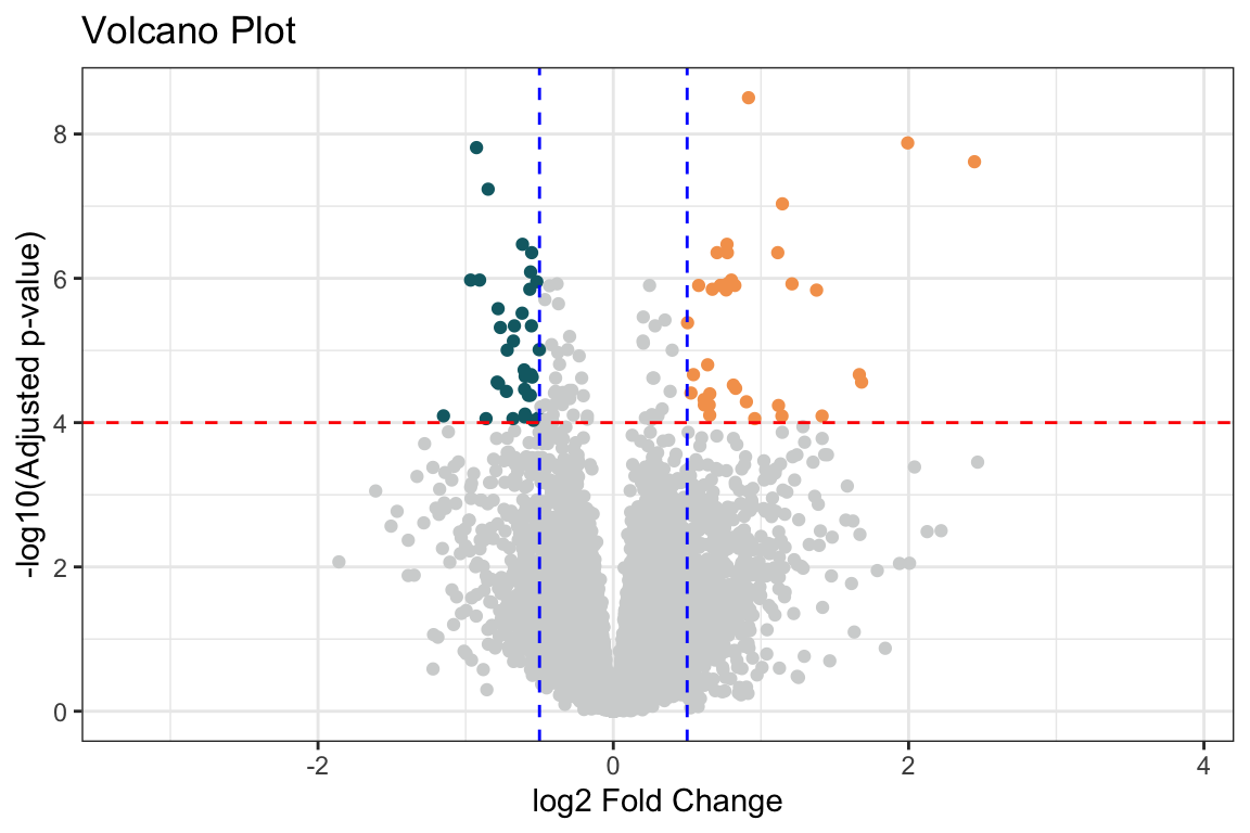
Il volcano plot è una rappresentazione grafica molto utile nell’analisi dell’espressione differenziale, in quanto permette di visualizzare in modo immediato i geni più significativi e con i maggiori cambiamenti di espressione.
Come funziona:
Asse x: Log2 fold change. Rappresenta la differenza di espressione tra due condizioni, espressa in scala logaritmica in base 2. Un valore positivo indica che il gene è sovraespresso nella condizione in esame rispetto alla condizione di riferimento, mentre un valore negativo indica che il gene è sottoespresso.
Asse y: -log10(p-value aggiustato). Rappresenta il valore negativo del logaritmo in base 10 del p-value aggiustato per test multipli. Un valore più alto sull’asse y indica una maggiore significatività statistica.
Punti: Ogni punto rappresenta un gene. La sua posizione sul grafico indica il suo log2 fold change e la sua significatività statistica.
Interpretazione:
Geni in alto a destra e in alto a sinistra: Questi geni sono i più interessanti, in quanto mostrano sia un log2 fold change elevato (in valore assoluto) che una significatività statistica elevata. Sono i geni più fortemente sovraespressi o sottoespressi.
Geni vicini all’asse y: Questi geni hanno un log2 fold change vicino a zero, quindi non mostrano una grande differenza di espressione tra le condizioni.
Geni vicini all’asse x: Questi geni hanno un p-value aggiustato elevato, quindi non sono considerati significativamente differenzialmente espressi.
Vantaggi:
Visione d’insieme: Il volcano plot fornisce una visione d’insieme dei risultati dell’analisi differenziale, permettendo di identificare rapidamente i geni più interessanti.
Identificazione dei geni significativi: I geni significativamente differenzialmente espressi sono chiaramente evidenziati nel grafico.
Valutazione del fold change: Il grafico permette di valutare l’entità del cambiamento di espressione per ciascun gene.
Esempio in R:
Mostra il codice R
# Crea un volcano plot con ggplot2FC<-.5pv<-0.0001out_res<-tibble( gene =res@rownames, baseMean =res@listData$baseMean, log2FoldChange =res@listData$log2FoldChange, lfcSE =res@listData$lfcSE,# stat = res@listData$stat, pvalue =res@listData$pvalue, padj =res@listData$padj)|>mutate(colore =case_when(log2FoldChange>FC&padj<pv~"#F5A15B",log2FoldChange<-FC&padj<pv~"#106973",TRUE~"#D2D4D4"))ggplot(out_res, aes(x =log2FoldChange, y =-log10(padj), color =colore))+geom_point()+geom_hline(yintercept =-log10(pv), linetype ="dashed", color ="red")+geom_vline(xintercept =c(-FC, FC), linetype ="dashed", color ="blue")+labs(x ="log2 Fold Change", y ="-log10(Adjusted p-value)")+ggtitle("Volcano Plot")+scale_color_identity(labels =c("Red", "Blue", "Green"))+theme_bw()#> Warning: Removed 10104 rows containing missing values or values outside the scale#> range (`geom_point()`).
In questo esempio:
geom_hline() aggiunge una linea orizzontale tratteggiata in corrispondenza del livello di significatività scelto.
geom_vline() aggiunge due linee verticali tratteggiate in corrispondenza del log2 fold change.
Mostra il codice R
pp<-ggplot(out_res, aes(x =log2FoldChange, y =-log10(padj), text =paste0("Gene: ", gene)))+geom_point(aes(color =colore))+geom_hline(yintercept =-log10(pv), linetype ="dashed", color ="red")+geom_vline(xintercept =c(-FC, FC), linetype ="dashed", color ="blue")+labs(x ="log2 Fold Change", y ="-log10(Adjusted p-value)")+ggtitle("Volcano Plot")+scale_color_identity(guide ="none")+theme_bw()+theme(legend.position ="none")plotly::ggplotly(pp)
Source Code
---params: mycondition: infection mynum: InfluenzaA mydenom: NonInfected mypval: 0.01 myfc: 0.8 mypadj: fdr---```{r}#| echo: false#| message: false#| warning: falsesource("_common.R")library(tidyverse)library(DESeq2) # BioClibrary(RColorBrewer)library(pheatmap)library(ggrepel)library(cowplot)library(DT)library(scales)library(vsn) # BioClibrary(apeglm) # BioClibrary(rmarkdown)library(gt)dds <-readRDS("data/DE.rds")res <-readRDS("data/res.rds")```# Volcano plot {#sec-vis-volcano}Il volcano plot è una rappresentazione grafica molto utile nell'analisi dell'espressione differenziale, in quanto permette di visualizzare in modo immediato i geni più significativi e con i maggiori cambiamenti di espressione.::: {.content-hidden when-meta="features.advanced_analysis"}**Come funziona:**- **Asse x:** Log2 fold change. Rappresenta la differenza di espressione tra due condizioni, espressa in scala logaritmica in base 2. Un valore positivo indica che il gene è sovraespresso nella condizione in esame rispetto alla condizione di riferimento, mentre un valore negativo indica che il gene è sottoespresso.- **Asse y:** -log10(p-value aggiustato). Rappresenta il valore negativo del logaritmo in base 10 del p-value aggiustato per test multipli. Un valore più alto sull'asse y indica una maggiore significatività statistica.- **Punti:** Ogni punto rappresenta un gene. La sua posizione sul grafico indica il suo log2 fold change e la sua significatività statistica.**Interpretazione:**- **Geni in alto a destra e in alto a sinistra:** Questi geni sono i più interessanti, in quanto mostrano sia un log2 fold change elevato (in valore assoluto) che una significatività statistica elevata. Sono i geni più fortemente sovraespressi o sottoespressi.- **Geni vicini all'asse y:** Questi geni hanno un log2 fold change vicino a zero, quindi non mostrano una grande differenza di espressione tra le condizioni.- **Geni vicini all'asse x:** Questi geni hanno un p-value aggiustato elevato, quindi non sono considerati significativamente differenzialmente espressi.**Vantaggi:**- **Visione d'insieme:** Il volcano plot fornisce una visione d'insieme dei risultati dell'analisi differenziale, permettendo di identificare rapidamente i geni più interessanti.- **Identificazione dei geni significativi:** I geni significativamente differenzialmente espressi sono chiaramente evidenziati nel grafico.- **Valutazione del fold change:** Il grafico permette di valutare l'entità del cambiamento di espressione per ciascun gene.**Esempio in R:**```{r}# Crea un volcano plot con ggplot2FC <- .5pv <-0.0001out_res <-tibble(gene = res@rownames,baseMean = res@listData$baseMean,log2FoldChange = res@listData$log2FoldChange,lfcSE = res@listData$lfcSE,# stat = res@listData$stat,pvalue = res@listData$pvalue,padj = res@listData$padj) |>mutate(colore =case_when( log2FoldChange > FC & padj < pv ~"#F5A15B", log2FoldChange <-FC & padj < pv ~"#106973",TRUE~"#D2D4D4" ))ggplot(out_res, aes(x = log2FoldChange, y =-log10(padj), color = colore)) +geom_point() +geom_hline(yintercept =-log10(pv), linetype ="dashed", color ="red") +geom_vline(xintercept =c(-FC, FC), linetype ="dashed", color ="blue") +labs(x ="log2 Fold Change", y ="-log10(Adjusted p-value)") +ggtitle("Volcano Plot") +scale_color_identity(labels =c("Red", "Blue", "Green")) +theme_bw()```In questo esempio:- `geom_hline()` aggiunge una linea orizzontale tratteggiata in corrispondenza del livello di significatività scelto.- `geom_vline()` aggiunge due linee verticali tratteggiate in corrispondenza del log2 fold change.:::```{r}pp <-ggplot(out_res, aes(x = log2FoldChange, y =-log10(padj), text =paste0("Gene: ", gene))) +geom_point(aes(color = colore)) +geom_hline(yintercept =-log10(pv), linetype ="dashed", color ="red") +geom_vline(xintercept =c(-FC, FC), linetype ="dashed", color ="blue") +labs(x ="log2 Fold Change", y ="-log10(Adjusted p-value)") +ggtitle("Volcano Plot") +scale_color_identity(guide ="none") +theme_bw() +theme(legend.position ="none")plotly::ggplotly(pp)```